Building Effective Landing Pages

As a result of the enquiries we have been receiving from advertisers regarding the performance of their advertising campaigns, we decided to put together this article to help prospective advertisers understand the key issues involved in running a successful banner advertising campaign. It must be borne in mind that these factors hold true regardless of the advertising platform.
Undoubtedly, everyone understands the need to advertise but not everyone knows how to make advertising work for them, especially, online advertising. Success in online advertising is a function of two very important factors, namely:
- The Quality of the Banner
- The Landing Page
Banner ads are one of the most prolific forms of marketing used in today’s online world. All companies use them in one form or another because they’re an affordable, measurable and effective medium to increase brand awareness. So, designing and creating quality web banner ads that will bring in those clicks cannot be over-emphasized.
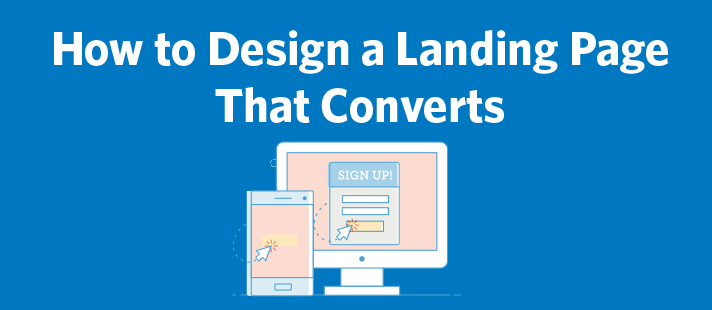
A landing page on the other hand, is a standalone web page, created specifically for the purposes of a marketing or advertising campaign. It’s where a visitor “lands” when they have clicked on advertiser’s banner or pay-per-click ad. Landing pages are designed with a single focused objective – known as a Call to Action (CTA). This simplicity is what makes landing pages the best option for increasing the conversion rates of your advertising campaigns and lowering your cost of acquiring a lead or sale. In this article, we’ll be discussing Landing Pages.
An effective landing page is the cornerstone of successful online marketing. Your offer may be stellar and your PPC ads might be optimized pieces of perfection, but without a good landing page, your business is bound to suffer. Your landing page layout needs to be flawless. A good, persuasive landing page grabs the attention of visitors and compels them to complete a conversion.
According to Andy Budd, “A good landing page needs to do three things successfully. First, it needs to be a natural continuation from where the user has just come from, giving them a clear signal that they are getting closer to what they need (also known as the scent of information). So, if they just clicked on an ad for widgets, they need to go to a page that is clearly focused on widgets, rather than the home page or a generic landing page.
Next, a good landing page needs to effectively answer the core sales objections the user will have. That could how much the thing will cost, what features it has, what it will look like, how it’s different from the competition, etc., etc. So, talk to prospective customers, or when failing that your sales team, make a list of the most common objections and ensure these are dealt with.
Lastly, you need to offer a clear, simple and pain free way of moving to the next step in the process. In fact, you may need to offer several routes in. So, try not to overwhelm the visitor with other offers, secondary calls to action or requests for marketing information, until you’ve got them through the door. Otherwise, you risk robbing Peter to pay Paul.”
Or, as John Tedesco puts it:
“Every great landing page much have these 3 primary ingredients (at least):
- Compelling offer
- Urgency for getting the offer right now
- The technology to deliver the offer
A Compelling Offer:
Whether it’s a downloadable file, a physical product, or a ticket to a live event, what you offer on your landing page must be clear and must clearly benefit the visit as quickly as possible. Assume the landing page visitor will only see this page one time. Use your headline, imagery, and text to entice the visitor to say ‘yes’ the first time. The offer should connect the dots between the pain points, challenges, or problems experienced by the visitor at the present as well as the results they can expect by taking you up on your offer.
Urgency of the Offer:
As a marketer, your chief job is to get your landing page visitors to make a decision about your offer as fast as possible. Ambivalence doesn’t do you nor your visitor any good. Use a countdown timer to highlight the urgency of choosing–and when the timer hits 0, redirect the page or change out your offer automatically to reinforce this urgency. Also, point to the landing page visitor’s frustration with their current situation, and encourage their quick decision to overcome that situation by getting your offer now instead of waiting around in a state of mediocrity.
Delivering the Offer:
Behind the scenes, a great landing page delivers on what’s promised automatically. Make sure your landing page is connected to your email service provider or CRM to deliver the promised offer within seconds or clicking the submit button. Use clear communication on the offer’s Thank You page to guide the new subscriber or customer to what’s next, and what they can expect from you moving forward.”
Conclusion
From the above, it is clear that landing pages play a crucial role in determining the success or otherwise of our banner advertising campaign. Would it not therefore make good sense to pay attention to it? As you plan your next pay-per-click or direct banner advertising campaign, we recommend that you pay attention to the issues raised here and work with your webmaster to build that compelling landing page that will effectively convert prospective trainees to training attendees.
See you online!


0 Comments